bin.moe
// brand & identity guidelines · v1
everything that makes bin look, sound and feel like bin ~ the name, the colors, the type, the voice, and the one rule that matters more than all the others: it's bin, never Bin.
bin is a person first and a brand second. the identity is a cozy-cyberpunk corner of the internet: a netrunner desktop glowing in the dark, rain on the window, music playing low, and someone on the other side who actually wants you to stay a while. technical, but warm. neon, but soft.
// three meanings, three letters
son of
in arabic, bin means "son of" ~ a patronymic that's literally part of his name. the truest reason, and the root of everything else.
binary
in .net, bin/ is where the build output lands. a c# person named after the compiled result ~ a little programmer pun baked right in.
recycling bins
he just likes recycling bins. no deeper reason needed ~ it makes him happy, and that's allowed to be the whole explanation.
// brand pillars
- warm, not cold. the cyberpunk look is the stage, not the personality. every glow should feel like a lamp left on, not a warning light.
- handmade. pixel icons, custom fonts, little easter eggs, diaries behind riddles. it should feel built by a person, never generated by a template.
- quiet confidence. lowercase, understated, never shouting ~ the work speaks; the name doesn't need a capital letter to be important.
- honest. the archive keeps the mess and the growth. the brand doesn't pretend to be polished where it isn't.
the name is bin. the b is never capitalized on its own ~ not at the start of a sentence, not in a title, not for "formality". Bin is never right.
lowercase is the default everywhere. the one exception is full caps, BIN, when the whole
surrounding ui is already shouting together (menus like BIN/, title bars, boot logs).
all three letters go up as a set or none of them do.
it's not a typo and it's not a style phase. all three meanings of the name are naturally lowercase:
in transliterated arabic names the particle bin is conventionally written in lowercase
(it connects a name, it doesn't start one), file extensions like .bin are lowercase,
and a recycling bin is just a common noun. the lowercase b is the name being exactly what it is.
that tall little ascender on the b is the brand's silhouette. sentence-case Bin turns the name into an ordinary word, like it's the first word of a sentence about trash cans.
do
don't
// edge cases
| situation | what to do |
|---|---|
| start of a sentence | keep it lowercase: bin is online. if it reads awkwardly, rephrase ~ never Bin. |
| all-caps ui | BIN is fine where everything is uppercase (sidebar BIN/, text-transform: uppercase bars, boot logs). no special handling needed. |
| title case / headlines | everything else can be title-cased; bin stays lowercase inside it. |
| mixed case | Bin, BiN, bIN ~ never. it's all-lowercase or all-caps, nothing in between. |
| handles & domains | written as bin.moe, hi@bin.moe, bin#0001 in prose ~ never Bin.moe. |
| code identifiers | follow the language's convention: window.binTheme, bin-theme, BinTheme in c# are fine. the rule is for the name as written prose, not for symbols. |
| autocorrect | phones love "Bin". turn it off, add bin to your dictionary, or fix it before sending. |
| words containing "bin" | binary, cabin, combine aren't the name ~ normal spelling rules apply. |
// lowercase checker
one palette, pink-forward. pink is the signature, violet backs it up, gold is reserved for
highlights and the moments that matter. everything sits on a near-black that's tinted blue,
never a flat #000. tap a swatch to copy its hex.
var(--c-primary) etc. (or rgba(var(--c-primary-rgb), .5) for alpha),
because visitors can repaint the whole site from the palette toy on the desktop and every page should follow along.
- machine voices (boot logs, system ids like
RESONANCE_OS) can shout in caps. human voices write in lowercase, and the name is never "Bin". - section headings are lowercase mono with a
//prefix. kickers sit under titles as// a short line. - keep line length comfy (~70 characters) and line height generous (1.7–1.8) for body copy.
bin writes like he's texting a friend he cares about: lowercase, warm, a little playful, a little nerdy, and honest when things are heavy.
sounds like
- all lowercase prose, first-person "i" included
- tildes to soften things ~ and ♫ to sign off
- terminal flavor:
>prompts,//comments,.exewindows - short, specific, a bit self-deprecating ("things i've built (and broke)")
doesn't sound like
- corporate: "leverage", "solutions", "we're excited to announce"
- title-case marketing headers with exclamation marks
- edgy-for-its-own-sake hacker speak
- anything that writes the name as "Bin"
neon glow
soft text-shadow in the element's own color, scaled by --glow. glow the important thing, not everything.
glitch + scanlines
.glitch with data-text for hero titles only, one per page. scanlines sit over everything, quietly.
windows & brackets
panels are windows: a mono title bar, a thin pink border, and corner bracket ticks. square corners, always.
> y
// access granted
terminal flavor
prompts, comments and a blinking cursor tie copy to the netrunner theme without needing extra graphics.
pixel icons
one icon family (pixelarticons via .pi), colored with currentColor. no emoji or entity glyphs in buttons.
atmosphere
matrix rain, ambient rain audio, a low music loop. the site should feel like a room, not a page.
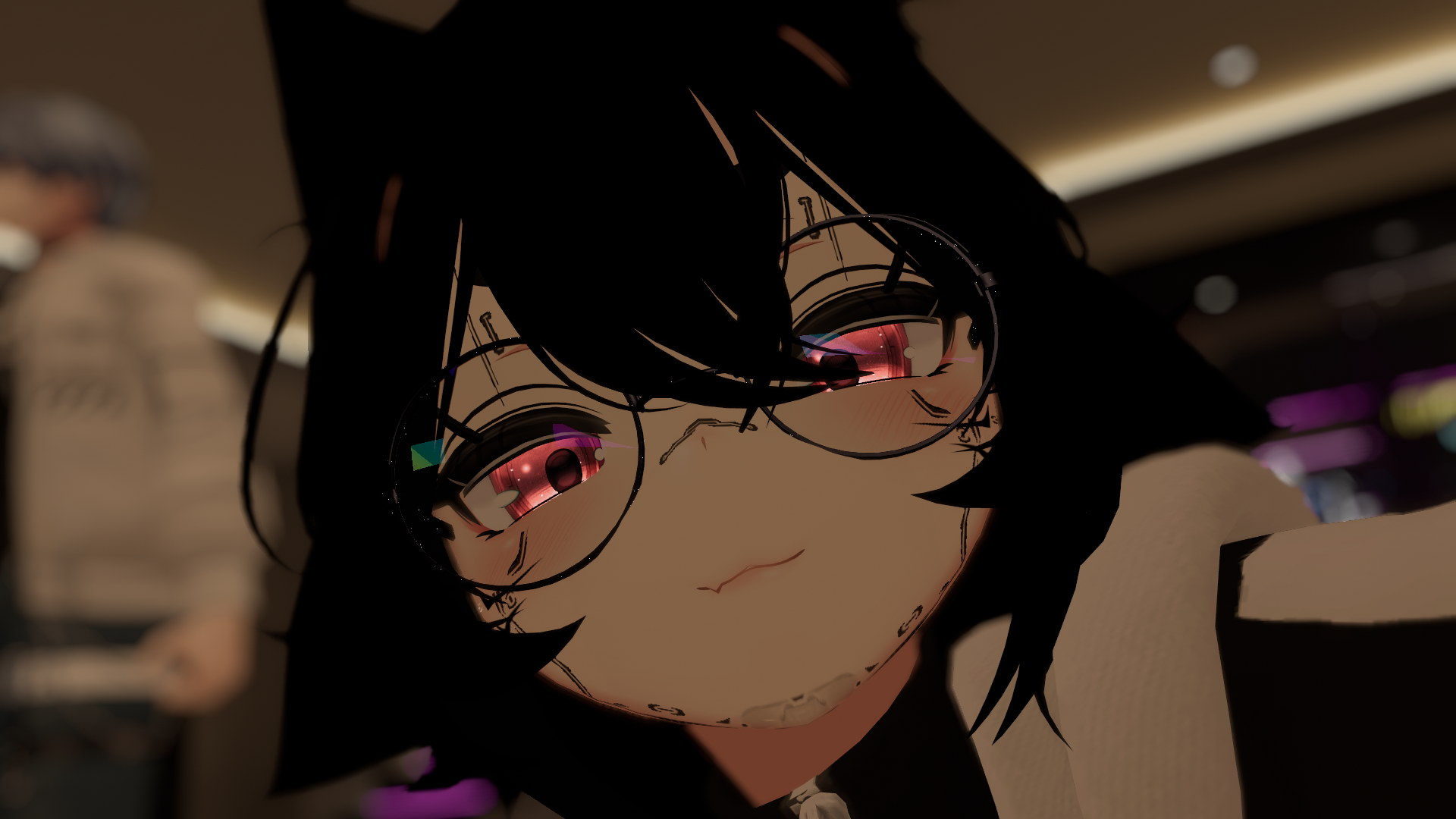 avatar · favicon, embeds, pfp
// please don't
- capitalize the wordmark. the logo is always lowercase bin (yes, this is on the page twice, it's that important).
- stretch, skew, outline, or add drop shadows that aren't the neon glow.
- put the pink wordmark on busy photos without a dark scrim behind it.
- recolor the wordmark outside the palette, or set it in a font that isn't the hero face.
> when in doubt: lowercase, warm, a little glow. ♫